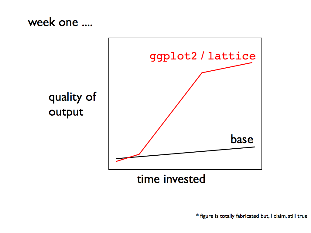
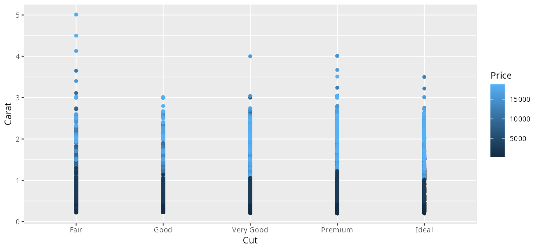
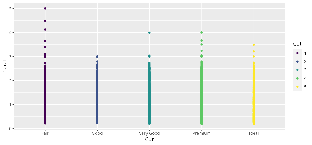
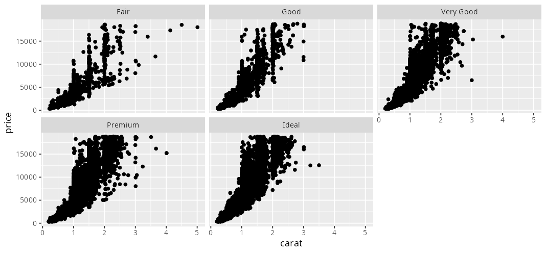
class: center, middle, inverse, title-slide # Introduction to ggplot2 ### Alec Robitaille ### 2017-11-02 --- <!-- https://www.rstudio.com/wp-content/uploads/2015/03/ggplot2-cheatsheet.pdf --> <!-- TODO: DURING: reiterate: if you are learning R for the first time why not learn the most flexible/efficient packages? make it interactive quiz the group see if we can build interesting plots together SOURCES/USEFUL: http://www.cookbook-r.com/Graphs/ mention the ggplot2 book, source code is open so i just built it... careful with books, they can get out of date. stackoverflow is big cheese --> # Why ggplot2? * flexible, efficient * **consistent** syntax  ## Example data | carat|cut |color |clarity | depth| table| price| x| y| z| |-----:|:-------|:-----|:-------|-----:|-----:|-----:|----:|----:|----:| | 0.23|Ideal |E |SI2 | 61.5| 55| 326| 3.95| 3.98| 2.43| | 0.21|Premium |E |SI1 | 59.8| 61| 326| 3.89| 3.84| 2.31| | 0.23|Good |E |VS1 | 56.9| 65| 327| 4.05| 4.07| 2.31| | 0.29|Premium |I |VS2 | 62.4| 58| 334| 4.20| 4.23| 2.63| | 0.31|Good |J |SI2 | 63.3| 58| 335| 4.34| 4.35| 2.75| --- # Expected data structure  ??? really important to think about data like this --- # Things to watch out for: * columns with >1 variable ``` ## cut_color price ## 1: Ideal_E 326 ## 2: Premium_E 326 ## 3: Good_E 327 ## 4: Premium_I 334 ## 5: Good_J 335 ``` * rows with multiple measures of the same individual/group ``` ## price Fair Good Very Good Premium Ideal ## 1: 326 0 0 0 1 1 ## 2: 327 0 1 0 0 0 ## 3: 334 0 0 0 1 0 ## 4: 335 0 1 0 0 0 ## 5: 336 0 0 2 0 0 ``` --- # The solution: data.table melt() and dcast() ``` ## Price Fair Good Very.Good Premium Ideal ## 1 7981 0 0 0 0 1 ## 2 6248 0 0 1 1 0 ## 3 2218 1 0 1 0 0 ## 4 984 0 1 5 0 5 ## 5 8782 0 0 0 0 1 ``` ```r melt(DT, measure.vars = colnames(DT)[-1], variable.name = 'Cut', value.name = 'Count') ``` ``` ## Price Cut Count ## 1: 514 Very Good 7 ## 2: 119 Good 12 ## 3: 294 Good 8 ## 4: 605 Ideal 14 ## 5: 394 Ideal 8 ``` --- # ggplot2 syntax ```r ggplot(DT) + geom_point(aes(x, y)) ``` * `ggplot()` * `geom_*()` * `aes()` --- # ggplot2 syntax: ggplot() Usually called with... 1. `ggplot()` 1. `ggplot(df)` 1. `ggplot(df, aes(x, y, ..))` ??? 1. for empty 2. to set the data source 3. to set data source and consistent aes most restrictive, but can be changed below in geoms regardless still --- # ggplot2 syntax: geom_* Type of layer added, for example: [ggplot2 graph gallery](http://www.r-graph-gallery.com/portfolio/ggplot2-package/) --- # ggplot2 syntax: aes **The rule is: if there is a data link, set it in the `aes`. Otherwise, it is set outside of the `aes`.** Links the data to aesthetic properties. * ID -> color * Treatment -> linetype * value -> point size (it also matches base R arguments to ggplot2 arguments eg: pch to shape, cex to size) Many properties: * size, shape, type * fill, color, alpha * linetype ??? <!-- THE RULE TO THINK ABOUT IS: --> <!-- am i using the data to set an aesthetic --> <!-- or is it a global setting --> <!-- inside aes we can call column names without quoting --> <!-- non standard evaluation --> --- class: review # Exercise: basic plotting 1. Open: `R/intro-ggplot-worksheet.R` 2. Complete section - Basic ggplot2 --- # Legend Legends are controlled by the function `guides()` To remove the legend ```r ggplot(diamonds) + geom_point(aes(cut, price, color = price)) + guides(color = FALSE) ``` To make finer adjustments to the legend, use: * `guide_legend` for discrete * `guide_colorbar` for continuous --- # Axis Labels Axis labels are controlled by the function `labs()` ```r ggplot(diamonds) + geom_point(aes(cut, carat, color = price)) + labs(x = 'Cut', y = 'Carat', color = 'Price') ```  --- # Use of factor variables ```r ggplot(diamonds) + geom_point(aes(cut, carat, color = factor(cut, labels = c('1', '2', '3', '4', '5')))) + labs(x = 'Cut', y = 'Carat', color = 'Cut') ```  --- # Facetting ```r ggplot(diamonds) + geom_point(aes(carat, price)) + facet_wrap(~cut) ```  --- # Combining plots **UPDATE**: The one and only... [`patchwork`](https://patchwork.data-imaginist.com/) --- class:review # Exercise: spatial Plotting 1. Open `intro-ggplot-worksheet.R` 1. Section - Spatial ggplot2 Considerations: * ensure your data is consistently projected/unprojected * `broom::tidy()` (or `fortify()`) SpatialPolygons **UPDATE**: use the `sf` package and `geom_sf` --- # Iterative plotting Need to make a plot more than once? **Don't Repeat Yourself...** Write a function! ```r PlotXY = function(in.dt, group, xcol, ycol){ g <- ggplot(in.dt) + geom_point(aes(get(xcol), get(ycol))) + labs(title = as.character(group)) print(g) return(1) } DT[, PlotXY(.SD, .BY, 'EASTING', 'NORTHING'), by = HERD] ``` --- class: clear ```r HistoWithVline <- function(in.dt, metric){ ggplot(in.dt[observed == 0]) + geom_histogram(aes(get(metric))) + geom_vline(aes(xintercept = get(metric), color = 'red'), data = in.dt[observed == 1]) + guides(color = FALSE) + labs(x = metric) } ByIDHisto <- function(in.dt, id){ g1 <- HistoWithVline(in.dt, 'centrality_soc') g2 <- HistoWithVline(in.dt, 'strength_soc') g3 <- HistoWithVline(in.dt, 'degree_soc') grid.arrange(g1, g2, g3, top = textGrob(as.character(id), just = "top")) return(1) } pdf('graphics/net_metrics_by_ID.pdf') all.dyn.net[, ByIDHisto(.SD, .BY), by = ID] dev.off() ``` --- # Multipanel plotting **UPDATE**: use `patchwork` function = `gridExtra::grid.arrange()` ```r lsPlots <- lapply(seq_along(lsDTs), FUN = function(i){ ID <- names(lsDTs)[i] g <- ggplot(lsDTs[[i]]) + geom_path(aes(EASTING, NORTHING)) + geom_text(aes(max(EASTING), max(NORTHING)), label = ID, color = 'forestgreen') + theme(axis.text = element_blank()) + labs(x = NULL, y = NULL) }) do.call(grid.arrange, lsPlots) # or # grid.arrange(grobs = lsPlots) ``` --- # Things to explore on your own * changing the theme (`theme()`) * `scale_color_*()` (and similar functions) for changing color ramps * `rasterVis::gmap()` for plotting rasters --- # Resources and references **UPDATE**: [the ggplot book](https://ggplot2-book.org/) https://github.com/jennybc/ggplot2-tutorial/blob/master/ggplot2-tutorial-slides/ http://vita.had.co.nz/papers/tidy-data.pdf http://www.r-graph-gallery.com/portfolio/ggplot2-package/ https://www.rstudio.com/wp-content/uploads/2015/03/ggplot2-cheatsheet.pdf